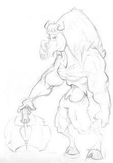
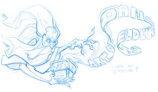
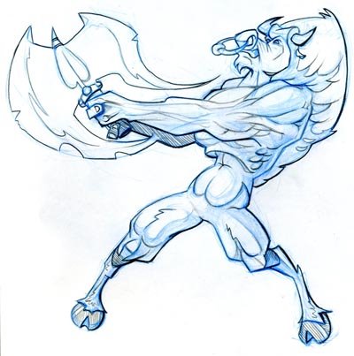
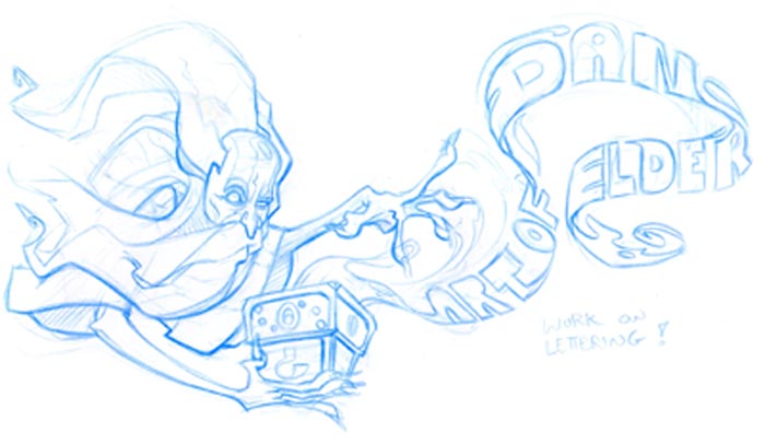
OK so another week, another post. I tried drawing a minotaur yet again but this time putting more of a buffalo spin on things it tunred out meh, The old man with the crappy lettering is going to be my banner, im leanring how to alter my blog to customize it better. The old man is cool but the lettering needs work im going to color it in flash since thats the only program I know really well and see if I can get some cool glow effects on the lettering. The reast is jsut what I did last night nothing much but at least its something..
-DAN-


12 comments:
Dan, you chose the same blog format I did, so I'll give you some advice from experience.
When I tried to make a banner for my blog, I made it long enough to stretch across the top. Bad move. With this format it appeared at the bottom and made the whole thing look like it contracted a computer virus or something.
So, for this format, I'd suggest making something tall and skinny rather than long so that it can fit on the side. Or, choose another blog format that will support a long banner.
Dude that wizard is great!
awesome approach for the hair/beard
gives it a great sense of motion....as does the movement in the magicy swirly smokey font of sexyness
bravo!
wow man, awesome stuff over here! I really like all of these sketches. bookmarked.
Your blog is really amazing. Love the characters design. This minotaur is awesome!
Minotaurs I find so hard! Try checking out Heinrich Kley's art. He was a great one for drawing minotaurs and fauns and centaurs and such. The hardest thing for me was always connecting the neck (which swings out) to the human body (damn it, it's upright)
Anyways, I love that top page, I think it looks pretty sweet, despite you saying it's only 'meh'
Beautiful fantasy charcters!
Hey Dan!
Your artwork is really awesome! Thanks for the comment on my blog too!
I really like your wizard/banner design. I need to customize my blog as well... curse that confusing html jargon :)
-Sarah
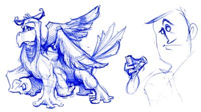
Nice stuff dan, though the footing on the top mintoaur isn't really convincing. I like the rest of him though. What's that one on the bottom of the page, is it supposed to be a griffon?
Thanks for all the comments guys I really appreciate it..
Dave: thanks for the heads up I hope I can get something working
Robin: yah I agree I should really be looking into more Bull anatomy. or in this case I wanna get a buffalo minataur.. is that called something diffirent?
Squid: i don't knwo what the hell it is... a 6 legged griffon I guess... don't ask questions
not a fan of your blog background. i've seen better drawings from you. the minotaur has nice structure and muscles, the top is a nice pose, but for me it lacks appeal in the face. doesn't seem like his face reads for the action. more expression, open mouth, maybe some spit flyng out. i like that you pushed the expression on the wizard more, i think you could push the curious expression more in his eyes further... maybe a slightly gaping mouth. like he's really in awe with "the art of daniel elder" perhaps even a little afraid of it. like he's unlocked something he can't control.
really like the minotaur dude, love drawings that have lots of thought in the muscles and anatomy!
The banner image looks like a good idea, look forward to seeing it up.
Where is it you work?
your drawing circles around me, nice work with all the sketching.
Post a Comment