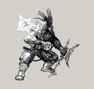
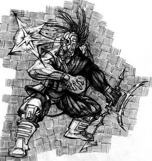
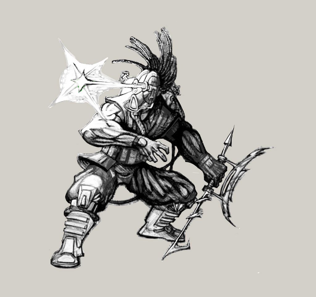
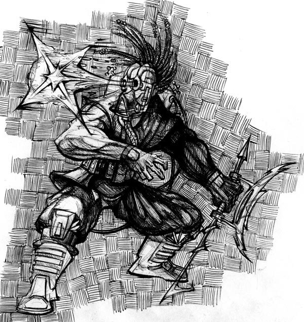
Ok so I did some more fan art of Mortal Kombat, My little bro wnated to see Kabal, who is also one of my more favorite characters in the game I think I did him not bad justice..its a little rough on the rendering but I really like the way the pose tunred out. So there you go Josh Enjoy bro. I tried going a little diffirent with Scorpion, making him more of a undead character then anything, I like what I have going but I know the pose could be stronger so I don't think im taking this peice any further then it already is. I am a big fan of constructive Crits so if you have some let me hear them. other then that I have been drawing like mad latley and I have alot more to post I will give these pics acouple days before I dump again.
Tell then, ENJOY!
(c 0_o) -DAN-
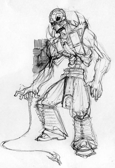
KABAL Update: trying to push the light and darks on him.

6 comments:
I love the first position! You caught that one nicely. The second one seems awkward. I can't quite place it. Maybe his back should be hunched over more.....or maybe his shoulder should arch in...I don't know....you should try him again in a different position. You have great line work as usual!;O) Would love to see some colored pics. Great post and can't wait to see more!
yup these are nice. After a long look the scorpion piece is really awkward, i know you don't want to re-work it, but i think there is something happening in this pic, you just havent released it yet...the style is cool, i like the costume, the undead motif is really working, his pose just isn't there, and the legs are too short...but I really think you should redo it, i know it'll payoff. As for the kabal, the action is working o.t. , the hand is crazy deadly and the hair is sweet, the eye shooty thing is awkward tho, and takes away alot of the movement you established...a lot! and the back arm is clunking up the pose a bit too, seems it should be outstretched a bit more for more balance (compostitionally), his legs also seem a bit on the short side, at first i thought it was the costume, but no...they are too short, especially below the knee. Thats it tho.
Kisses!
Those are all good suggestions thanks guys thats what im looking for!!!
hey Duke,
I'll only say two tings about Kabal, #1 it looks pretty cool, nice detail work and the hand is really good. But,#2, I feel like the eye beam is or was just thrown on at the end. Its stronger without it.
Scorps, i like the dead guy thing as well, I really like it, very soul reaver esc. I think the reaseon it looks weird (as helle says) is simply because its off balance, look at where your center of gravity is, its back to far and his feet are too far foreward. other than this though, i like what you did.
Hank out!
This is super nice! I agree with the above crits but I think the rest is sweet. Awesome job framing his right hand in the negative space under his left arm - it really reads!
these are really cool, and i guess besides the crits already made, lets see these folks in some crazy poses, the designs are really cool, but lets get some attitude
Post a Comment